O-Pro – A technology brand story begins with a distinct identity
The O-Pro’s brand story begins with a challenge: How do you demonstrate the modernity of Japanese technology while also conveying the humanistic mission encapsulated in healthcare products?
It’s a tricky question, but nothing is impossible with the S-World team! Let us look for the solution to the above problem in the following S-World article.
Building a story from a humanitarian mission
Technology has always been a rather complicated and technical subject, so the first task in a brand identity project is to pick out the most unique and outstanding aspects, thereby creating a brand story that is not dry, engaging and inspiring.
Metran (Japan) is a company that specializes in medical equipment research and development, production, and export, particularly artificial ventilators and respiratory monitors. S-World officially becomes Metran’s global business media partner. S-World will help Metran connect with potential partners and customers worldwide and provide marketing and communication services for the launch of Metran’s new product, the O-Pro high-tech air purifier mask.

O-Pro is sent with the mission “Save lives” of inventor Tran Ngoc Phuc, chairman of Metran Group – Japan’s leading ventilator manufacturer. The mission of the S-World team is to combine this noble mission with high-tech elements, to create an identity that matches the spirit of the product maker and helps build deep relationships. with the user.
Decoding the O-Pro logo brand story
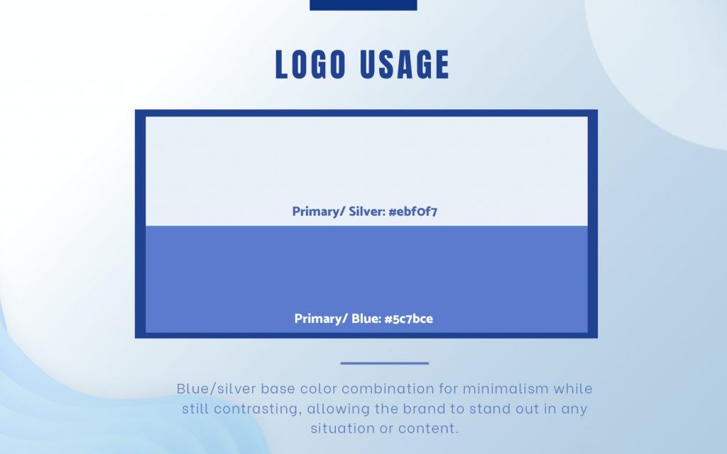
The O-Pro identity was officially born with the main character being an infinity symbol logo in a blue/silver palate. The minimalism and contrast of this color palette gives a modern, fresh and vibrant breath to the design content.
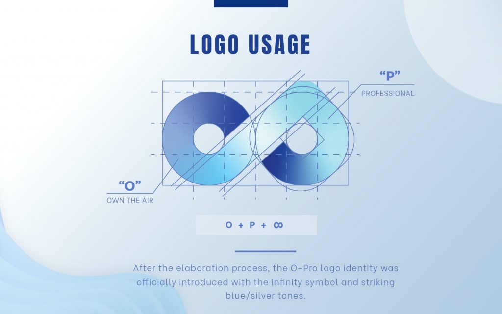
The O-Pro logo is a combination of the two letters O (Own The Air) and P (Professional) in the product name, when placed together they creates the infinity symbol. The infinity circle is a symbol representing an infinite cycle, which has no beginning or end. So why can this logo represent O-Pro?
This infinity loop epitomizes O-Pro’s signature closed-loop continuous air circulation technology, which continuously purifies the flow of air you inhale and exhale. This symbol also represents the hope of the creators, to bring clean air to people all over the world, regardless of geography or ethnicity. This loop also represents endless technological creativity, always transforming, innovating for a better tomorrow.

Continue to explore the meanings behind logos, and the hidden stories, and discover the harmony between font details and brand colors in S-World’s many more branding projects!
The O-Pro’s brand story begins with a challenge: How do you demonstrate the modernity of Japanese technology while also conveying the humanistic mission encapsulated in healthcare products?
It’s a tricky question, but nothing is impossible with the S-World team! Let us look for the solution to the above problem in the following S-World article.
Building a story from a humanitarian mission
Technology has always been a rather complicated and technical subject, so the first task in a brand identity project is to pick out the most unique and outstanding aspects, thereby creating a brand story that is not dry, engaging and inspiring.
Metran (Japan) is a company that specializes in medical equipment research and development, production, and export, particularly artificial ventilators and respiratory monitors. S-World officially becomes Metran’s global business media partner. S-World will help Metran connect with potential partners and customers worldwide and provide marketing and communication services for the launch of Metran’s new product, the O-Pro high-tech air purifier mask.

O-Pro is sent with the mission “Save lives” of inventor Tran Ngoc Phuc, chairman of Metran Group – Japan’s leading ventilator manufacturer. The mission of the S-World team is to combine this noble mission with high-tech elements, to create an identity that matches the spirit of the product maker and helps build deep relationships. with the user.
Decoding the O-Pro logo brand story
The O-Pro identity was officially born with the main character being an infinity symbol logo in a blue/silver palate. The minimalism and contrast of this color palette gives a modern, fresh and vibrant breath to the design content.

The O-Pro logo is a combination of the two letters O (Own The Air) and P (Professional) in the product name, when placed together they creates the infinity symbol. The infinity circle is a symbol representing an infinite cycle, which has no beginning or end. So why can this logo represent O-Pro?

This infinity loop epitomizes O-Pro’s signature closed-loop continuous air circulation technology, which continuously purifies the flow of air you inhale and exhale. This symbol also represents the hope of the creators, to bring clean air to people all over the world, regardless of geography or ethnicity. This loop also represents endless technological creativity, always transforming, innovating for a better tomorrow.

Continue to explore the meanings behind logos, and the hidden stories, and discover the harmony between font details and brand colors in S-World’s many more branding projects!


